Summary
Jon Campbell’s artwork bears more than a passing resemblance to graphic design, particularly his typographic works, which seize with precision the vernacular of suburban Australia and the immediacy of popular culture. Through his use of words and phrases as imagery, Campbell captures aspects of his culture that are lived and observed; local, national and international; and that can be spoken, written, sung and read. The mediums in which he expresses his compelling catchphrases range over paintings, cut-outs, neons, textiles, banners, badges, prints and more. The works define not only the look of the world in which Campbell lives, but also the accent and humour of its language and how visual signs can articulate culture and history. These signs are sometimes loud and boisterous but never offensively so. They have a beauty and sense of celebration about them that encourages belief.
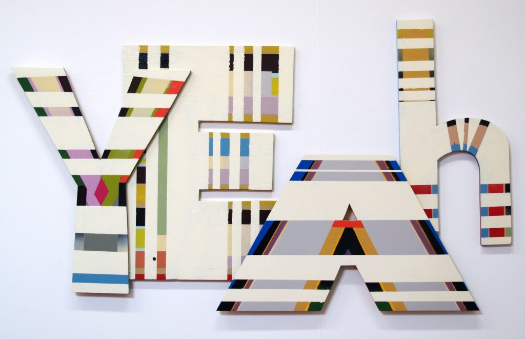
In Campbell’s hands, ‘yeah’ is not resigned or sarcastic, as it could be conceived, but defiant and positive. The backstory to this plywood cut-out iteration in the ‘Yeah’ series is that it came from a project on flags that began with the group show ‘Ahoy’ in New Zealand. In place of the usual pedestrian iconography of a flag, Campbell emblazoned the upbeat ‘yeah’ in hot pink across a ground of green. The flag project took on a life of its own back in Melbourne, and so too did ‘Yeah’, which appears in many mediums. This cut-out version, with its two layers, changing case and its bands of colour, abstracts the clarity of the word on the flag, but it also lends a lovely dynamism to the utterance, as the letters bounce and dance in relation to one another.
